
Designing a Mobile Marketplace for Singapore Service Bookings
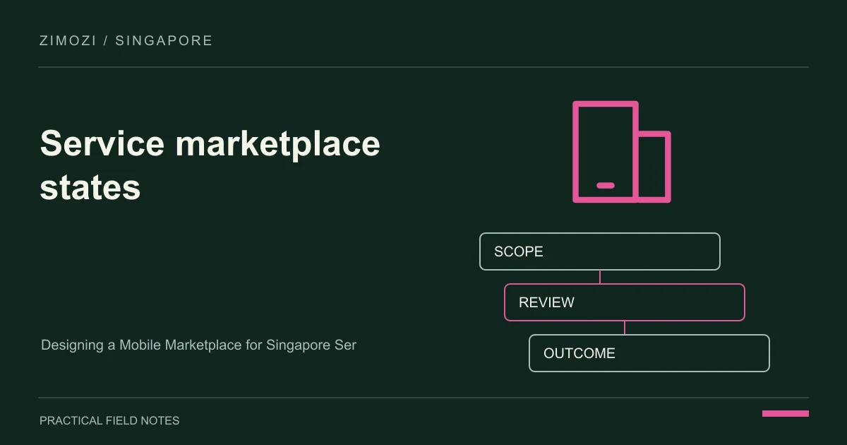
A service marketplace must keep customers and providers in agreement about what has been booked. On a phone, the difficult part is rarely shrinking the desktop navigation.
It is helping someone understand availability, price conditions and the status of a request while they move between other tasks. For a Singapore marketplace connecting households with service providers, unclear states create support work on both sides.
This guide describes a booking journey from search through provider response to completion. You will learn which mobile screens deserve early testing and which operational rules must exist before a designer can produce an honest confirmation screen.
In this guide
- What should a customer know before requesting a slot?
- How do provider responses change the interface?
- What does a credible mobile launch require?
- Which design shortcuts create disputes?
- Decision checklist
- FAQ
- Further reading
What should a customer know before requesting a slot?
Show the service area, scope, provider availability and whether the price is final or indicative. A hypothetical home-maintenance marketplace should distinguish a site visit from a completed repair.
If providers confirm manually, describe the action as a request. Preserve entered details when a customer returns from checking a message or comparing another service.
How do provider responses change the interface?
Design pending, accepted, declined, expired and cancelled states explicitly. Give the provider enough information to decide without exposing unnecessary customer details.
When a provider proposes a different time, require customer agreement before replacing the booking. Keep notifications and the in-app record consistent, with one authoritative booking reference for support staff.
What does a credible mobile launch require?
Budget for both sides of the transaction, not just customer search. Test narrow screens, keyboard navigation and interrupted requests on real devices.
Include a support console and a way to resolve disputed status. Responsive layout is necessary, but operational testing should also check duplicate submissions and a provider replying after a request has expired.
Which design shortcuts create disputes?
Avoid displaying every provider as instantly available or using a success animation before acceptance. Do not remove fee conditions to make a card cleaner.
A clear explanation of the next step is more useful than a visually impressive but ambiguous booking flow.
Decision checklist
- Show the service area, scope, provider availability and whether the price is final or indicative.
- Design pending, accepted, declined, expired and cancelled states explicitly.
- Budget for both sides of the transaction, not just customer search.
FAQ
Is responsive design enough for a marketplace?
No. Booking rules, provider actions and support handling also need to work on mobile.
Should customers create an account first?
Delay unnecessary registration while preserving a secure way to retrieve and manage requests.
Can availability be approximate?
Yes, if the interface clearly distinguishes an enquiry from a confirmed slot.
What should happen after cancellation?
Show the resulting booking state and any applicable next steps consistently to both parties.
Which journey should be tested first?
Test one complete request, provider response and customer confirmation before expanding discovery features.
Further reading
Technical reference: Responsive web design basics. The scenarios above are illustrative, not client case studies.
Related articles: A UI/UX Process for Singapore Internal Tools: Design Around Exceptions and Choosing an E-commerce Platform for a Singapore Wholesale Business.